Udemy Blog
Turning an overlooked asset into a legitimate business growth driver in under 30 days.

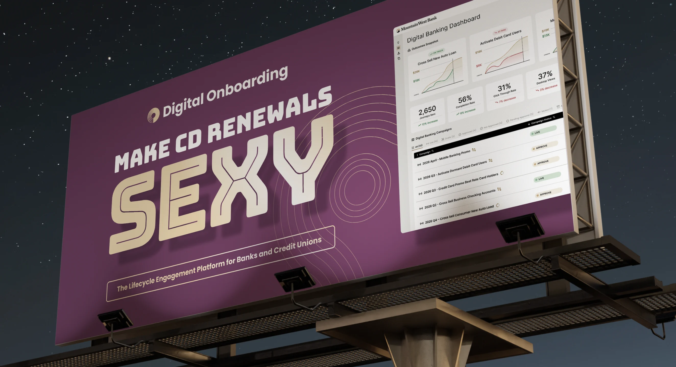
Digital Onboarding gives bank and credit union marketers the ability to do big things. I was brought in to reimagine the brand from the ground up. I partnered with internal stakeholders to define the goals, shape the strategy, concept the creative, then design and produce every artifact. From billboards to boardrooms, all touch points now share one confident, approachable and trustworthy voice.
Brand strategy
Logo and identity
Design system
Brand guidelines
Awareness campaign
Social and digital ads
Website redesign
Booth and event
Sales collateral
Presentation template
Email template
Animation
A full rebrand is ambitious under any conditions. This one had to survive two CEOs and three CMOs, each bringing a fresh perspective and new priorities. Budgets were lean, timelines were tight, and a wide circle of senior stakeholders needed to land on a shared vision. The question wasn’t just what the brand should become, but how to keep it moving forward while the room kept changing.
I anchored the work in a strategic center that every new leader could quickly understand and get behind, so the vision held even as the team around it changed. I guided the team with clear rationale, keeping momentum without sacrificing alignment. On the craft side, I held every deliverable to the same standard, giving the overlooked assets like email footers, one-pagers and slide templates the same care as the billboards and homepage. The result is a brand that feels considered at every touchpoint, no matter how small.

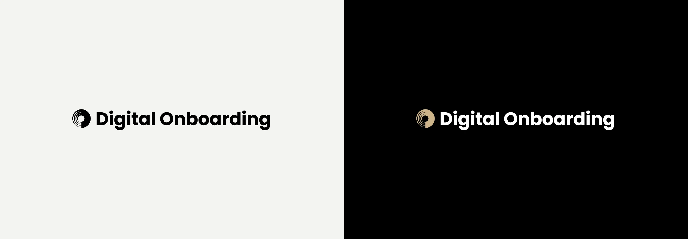
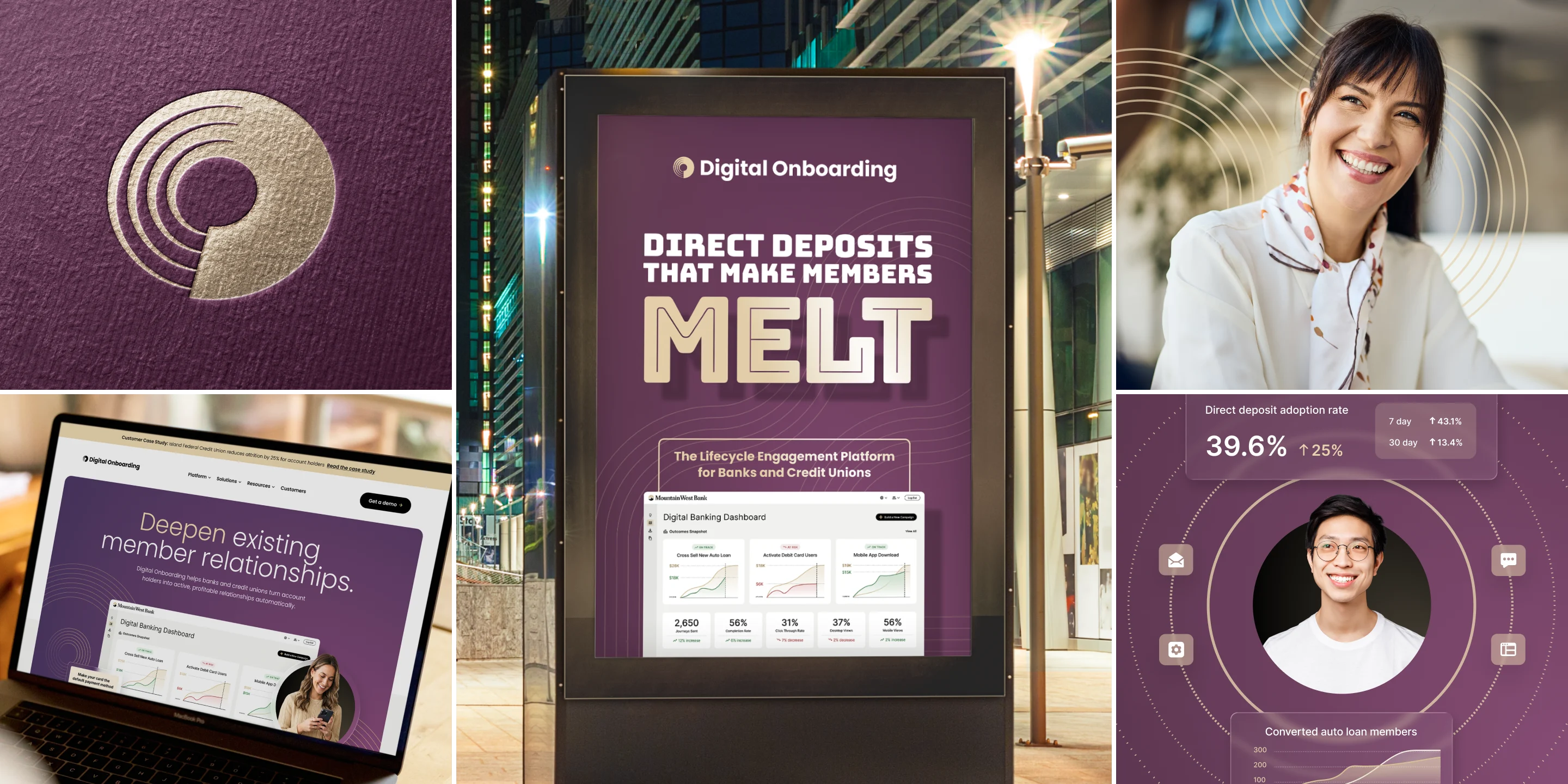
The new mark is built from concentric, flowing lines that circle inward, a nod to the ongoing engagement lifecycle between a financial institution and its members. As the lines move through their cycle, they reveal a D and an O, brought together into a single form. The mark suggests the complexity of data in motion and a customer path that keeps unfolding, while staying simple enough to read at any size. Paired with a clean, modern wordmark, it gives Digital Onboarding an identity that feels both established and forward-moving.
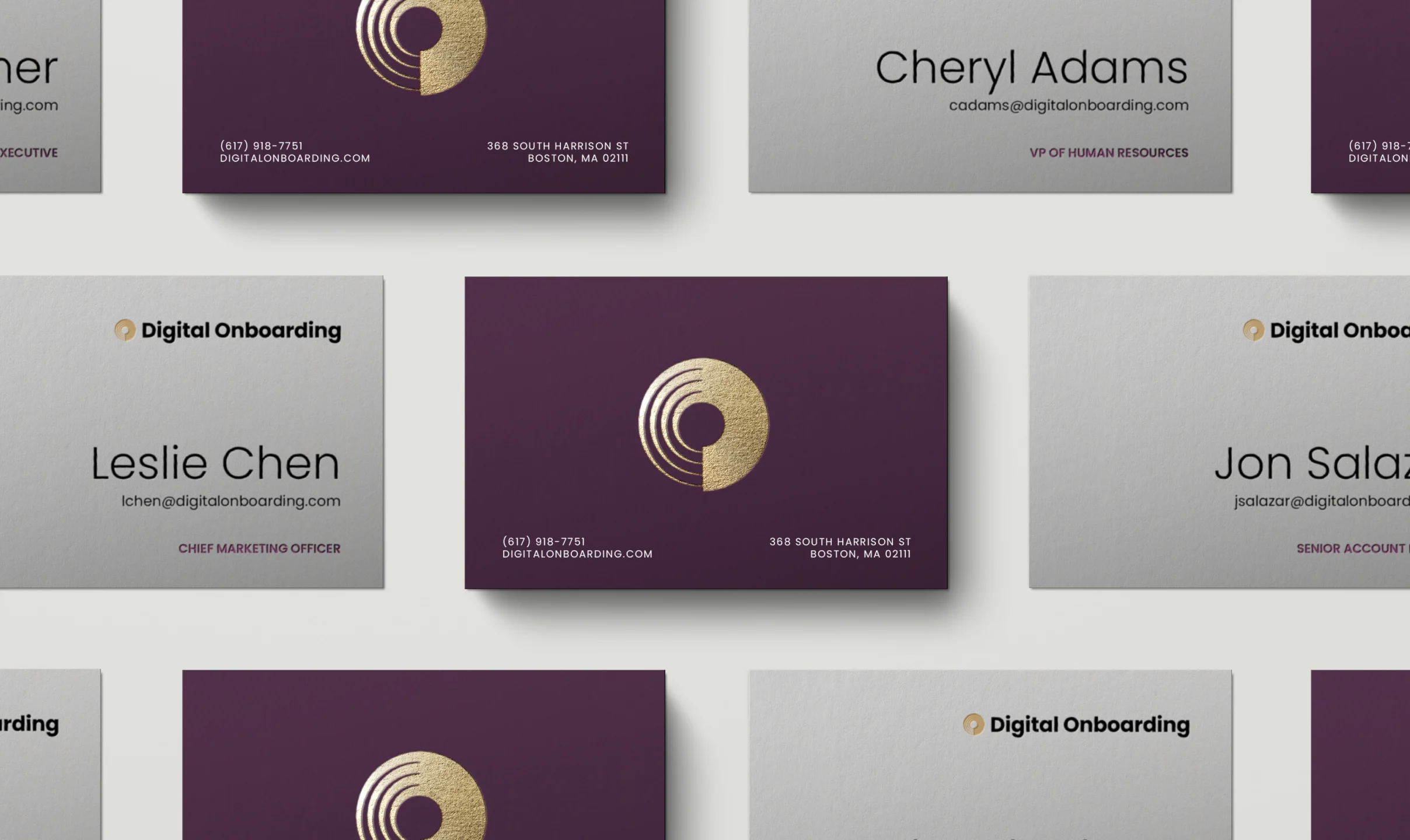

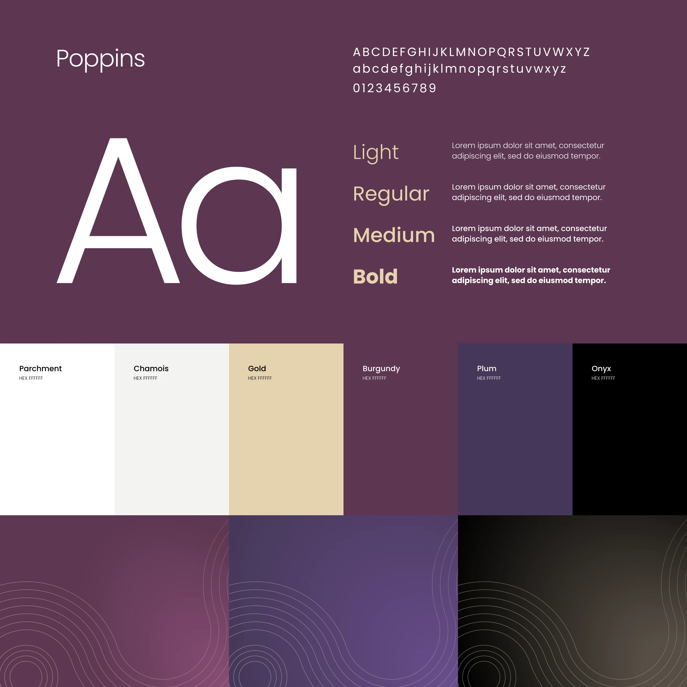
In a category awash in safe blues, a rich palette of plum, sand and cream sets Digital Onboarding apart and signals prosperity. Poppins, a clean geometric sans-serif, keeps the voice contemporary and unmistakably digital. Signature line patterns, drawn from the mark, express frictionless data flow and ongoing engagement. Together they form a flexible system that feels premium yet approachable, and scales easily from a business card to a billboard.
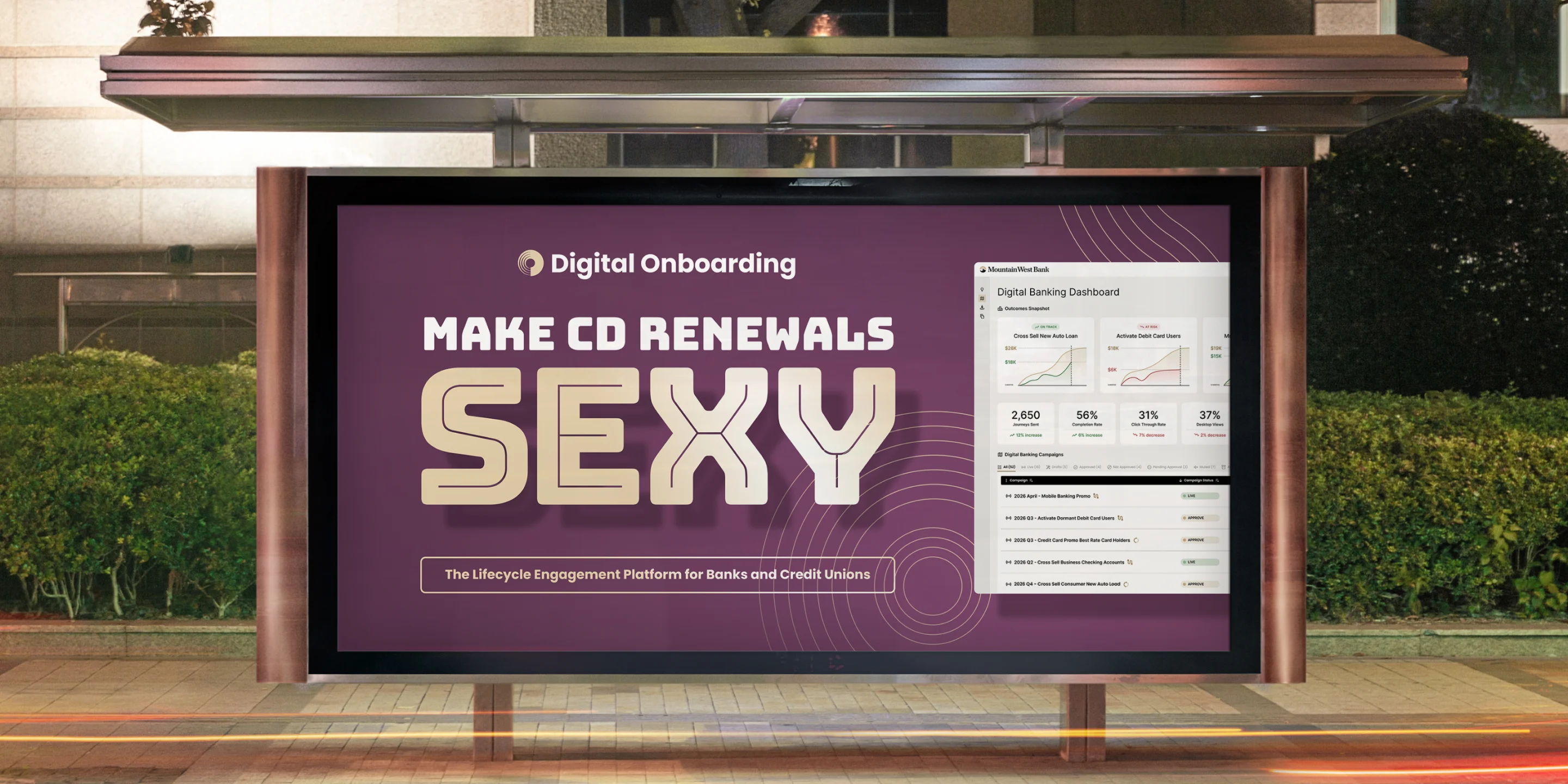
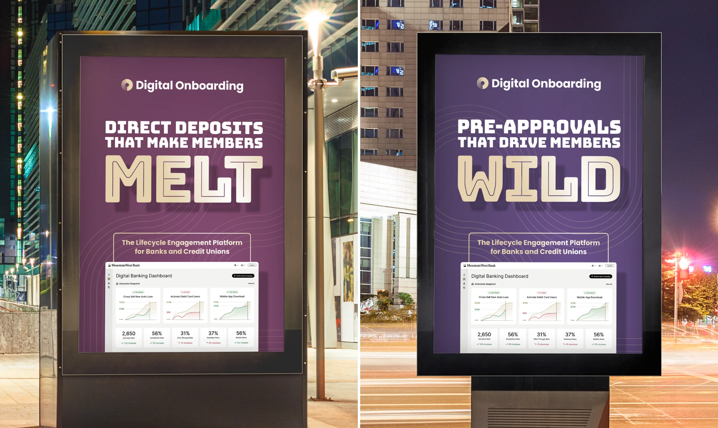
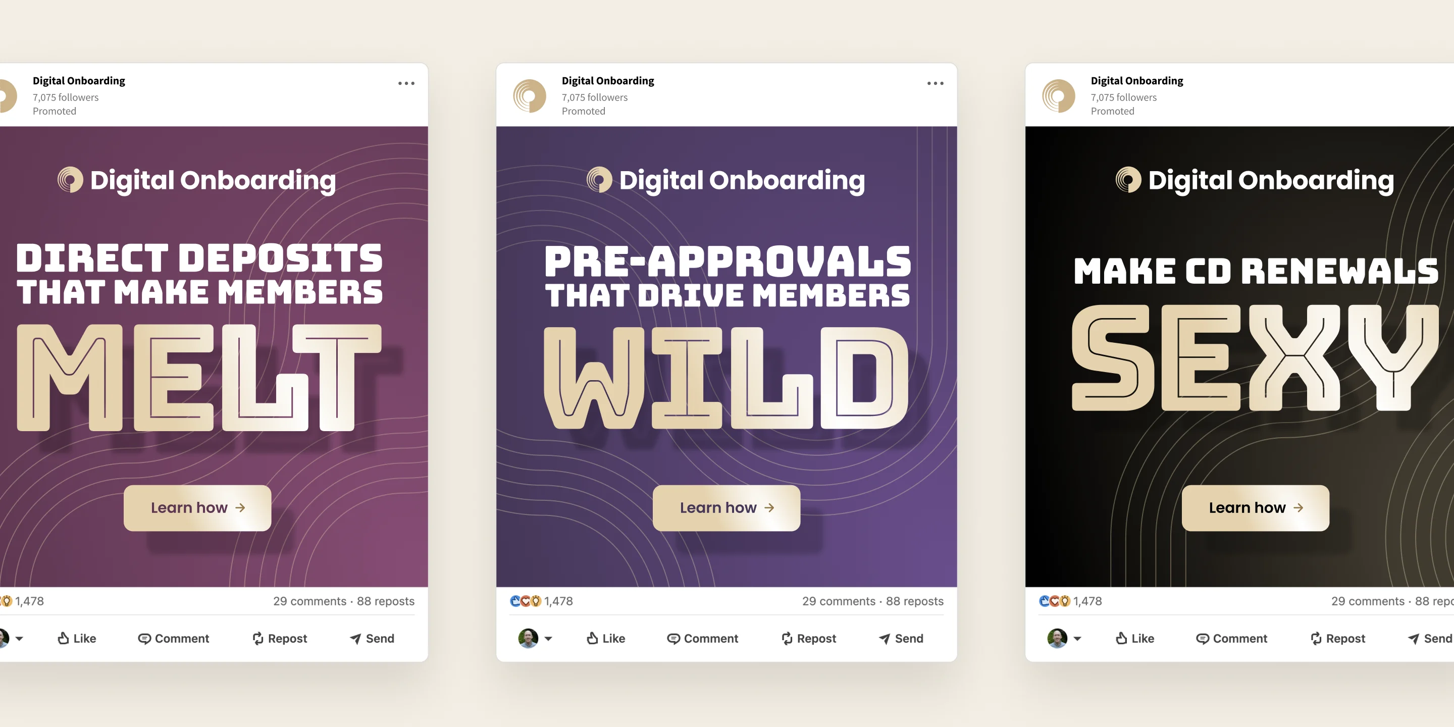
To introduce the new brand, I concepted a cheeky awareness campaign that pairs everyday banking products with a dash of desire. Headlines speak directly to bank and credit union marketers, promising results they’ll actually get excited about. The campaign gave a traditionally conservative category reasons to stop, smile and reconsider.
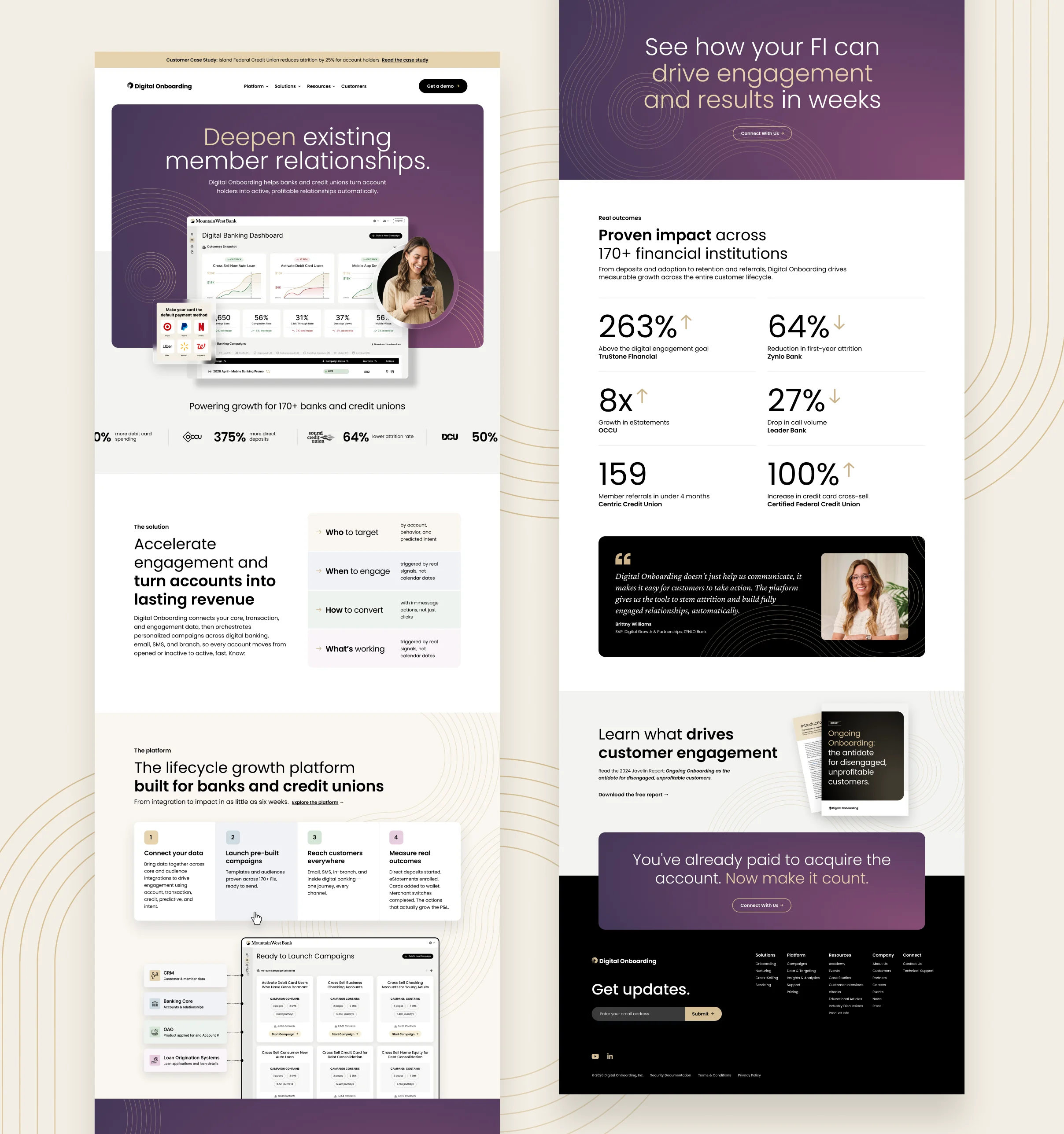
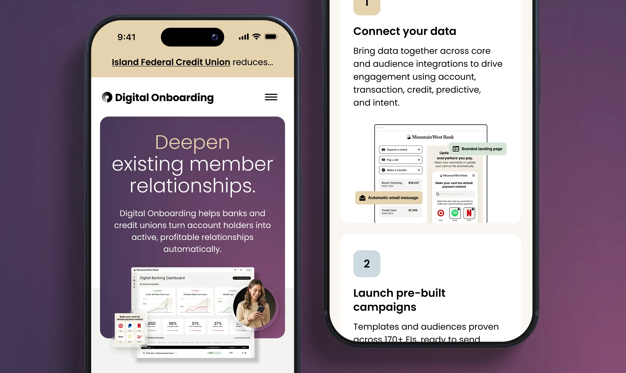
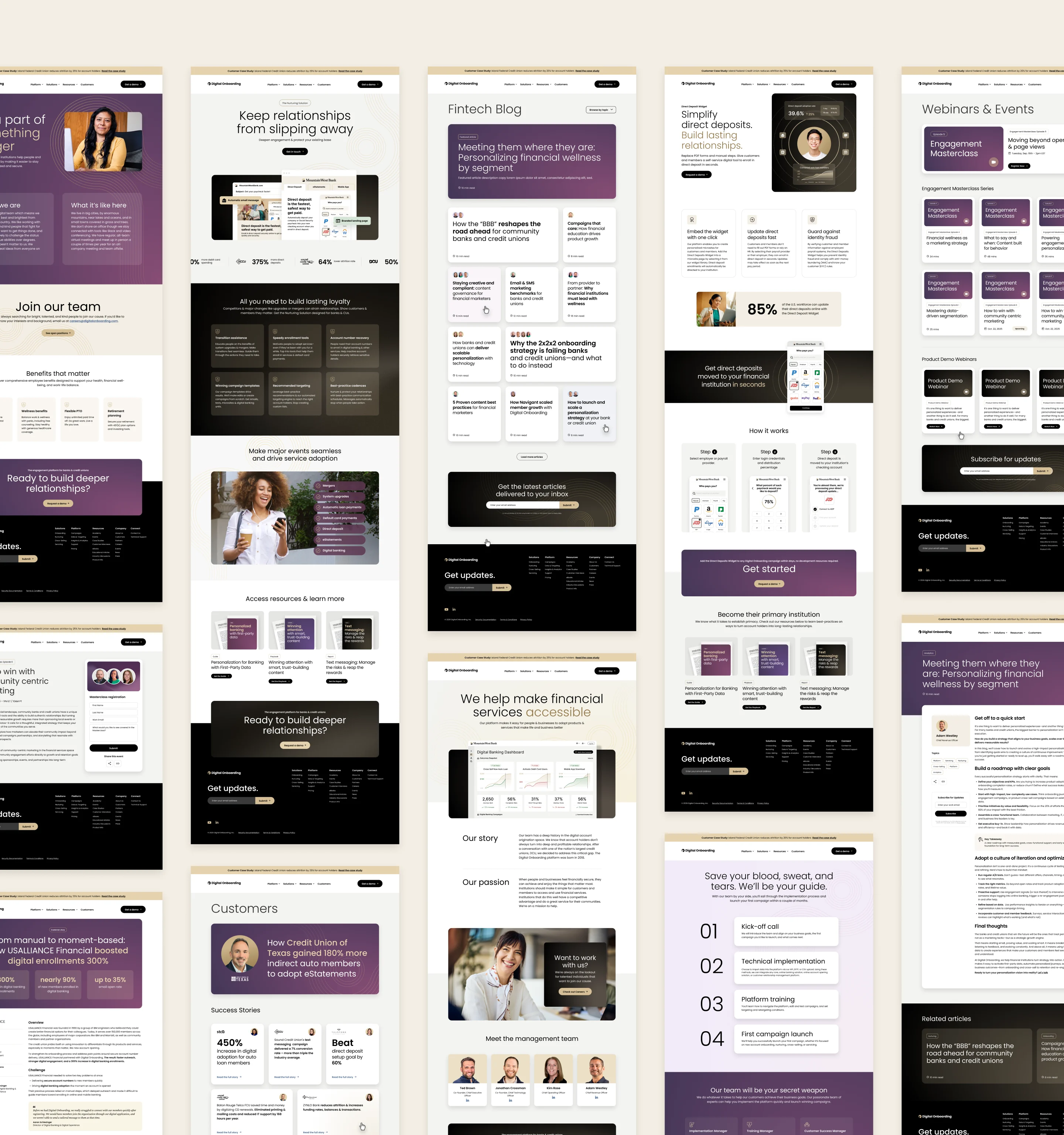
The website is where the brand makes its fullest case, so I designed it to feel as easy as the platform it sells. Clear storytelling, bold proof points and plenty of breathing room guide visitors from first impression to demo request. Every page, from the homepage to product and solution pages, was designed and built to scale responsively across desktop and mobile.
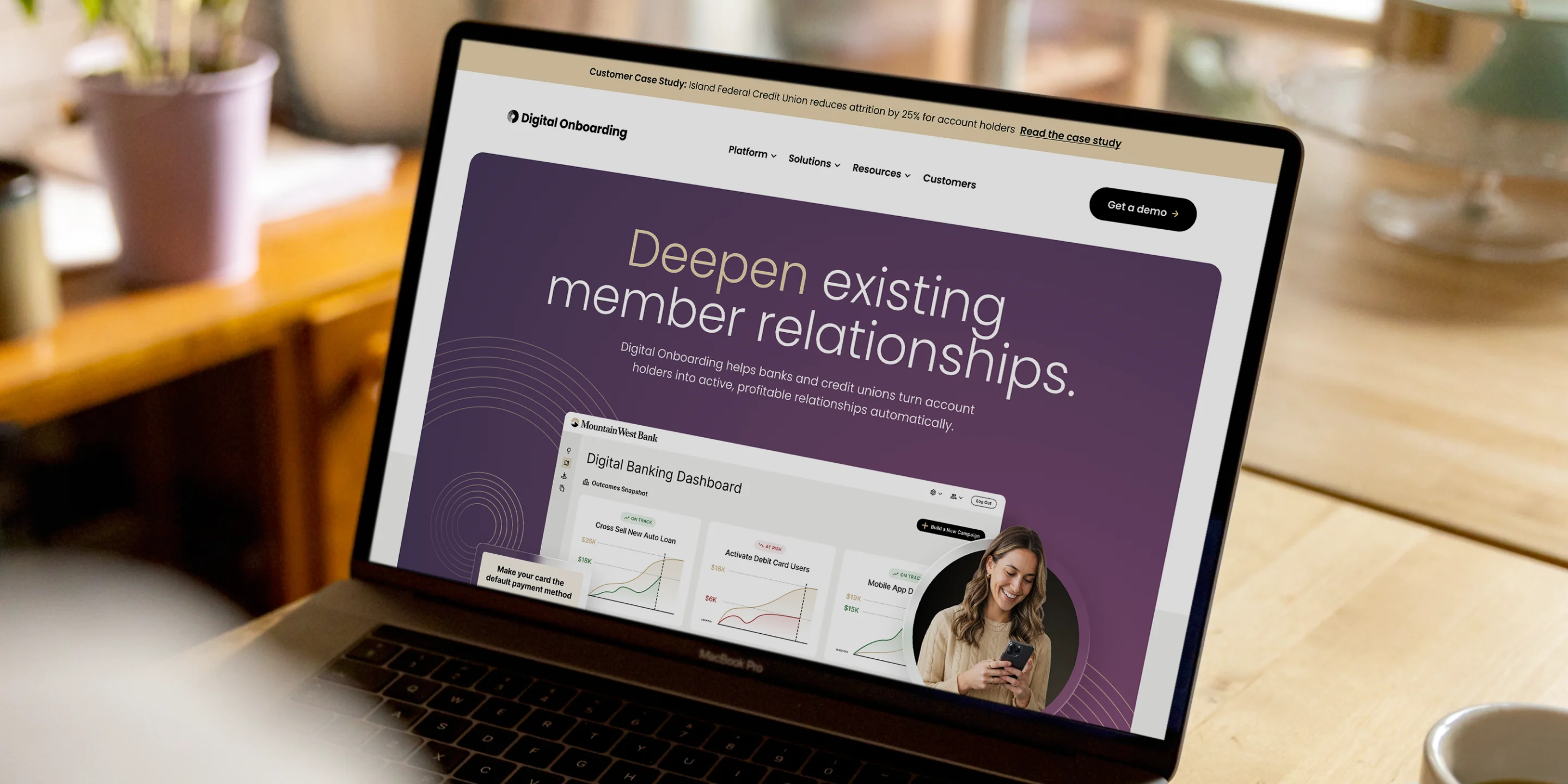
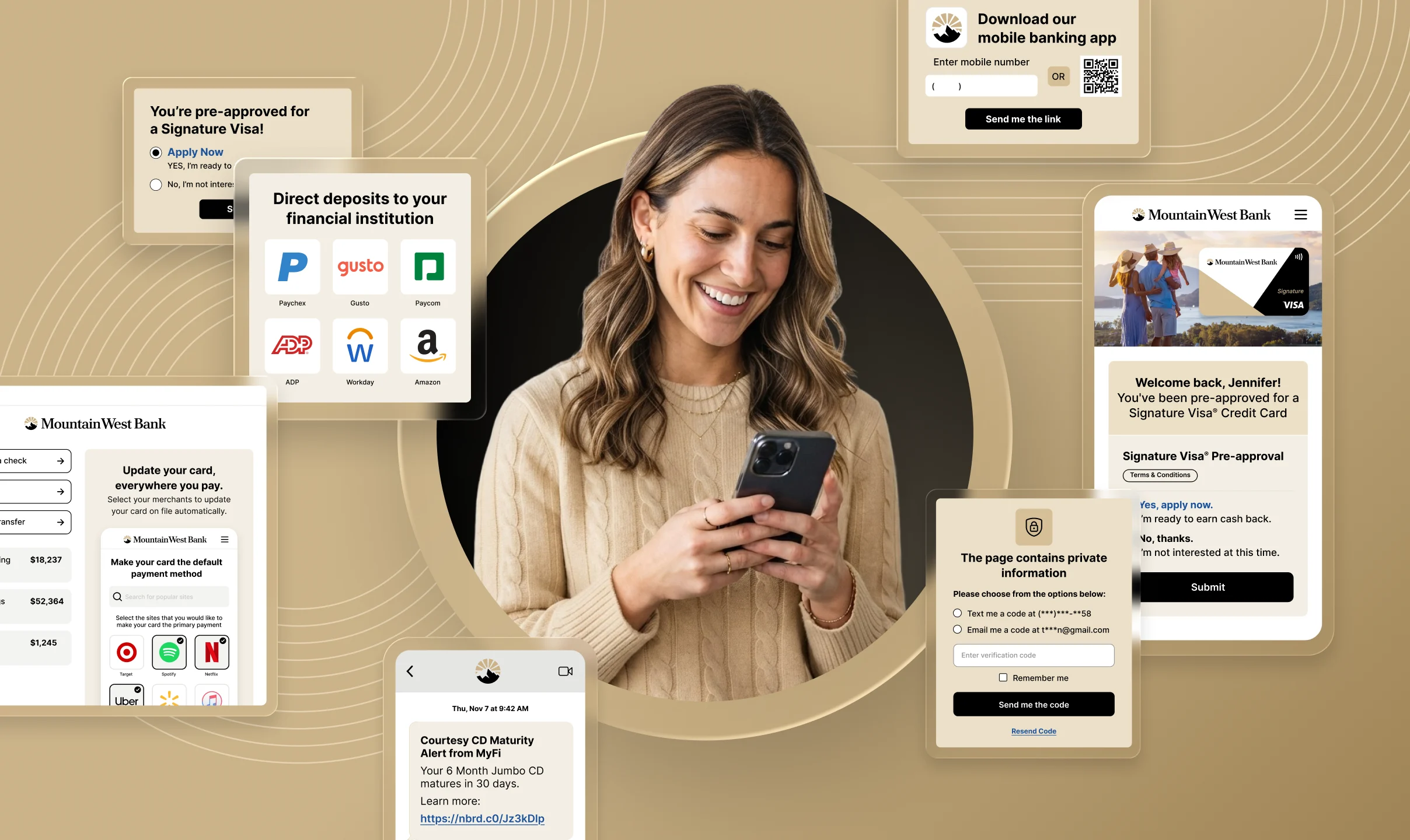
Warm, candid photography puts real people at the center of a data-driven story. I paired it with stylized UI cards and metric callouts that hint at the platform in action, framed by the brand’s signature line patterns. The result is a library of building blocks that adds richness and personality to every layout, while keeping ease-of-use and approachability at the center of the visual conversation.

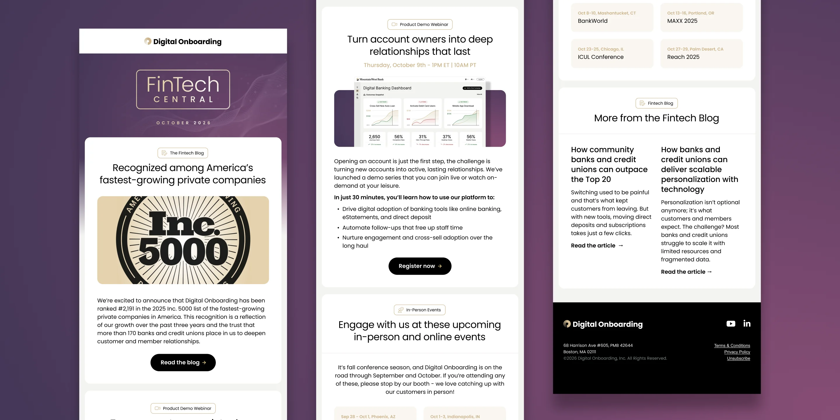
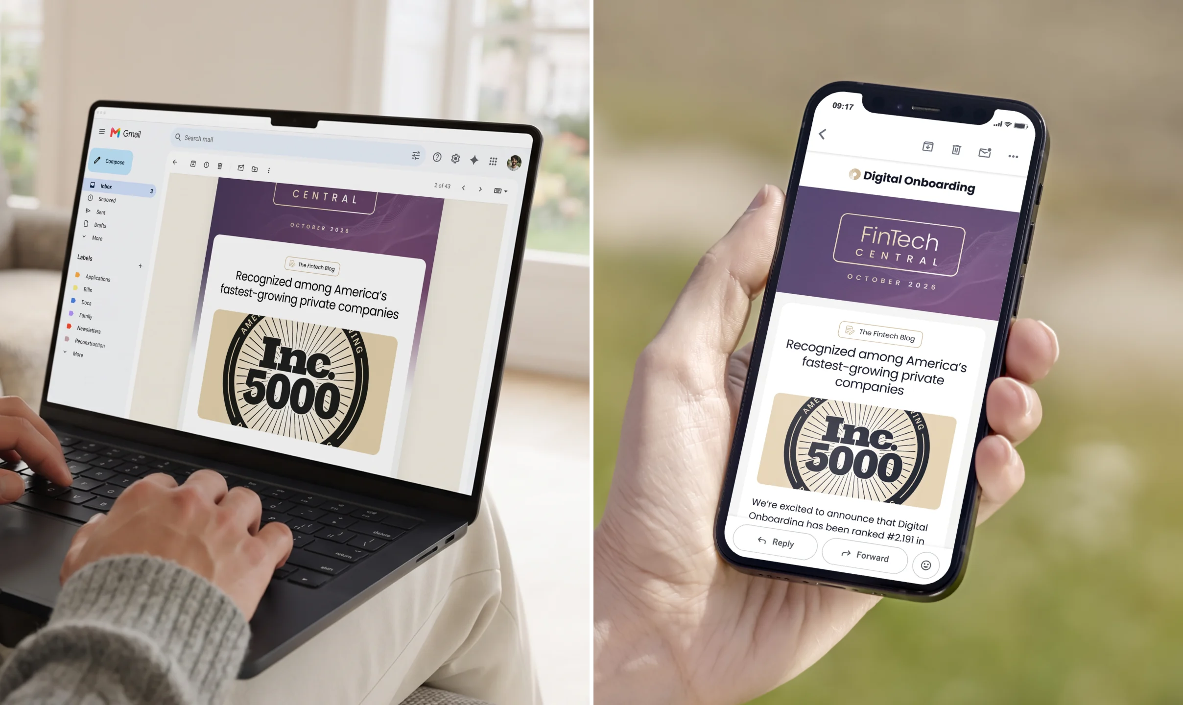
Email is where Digital Onboarding talks to customers and prospects most often, so it deserved the same care as the billboards. I designed a modular template system that lets the marketing team assemble newsletters, announcements and nurture emails quickly, without ever stepping off-brand. Every module is built to look sharp on any device and in any inbox.
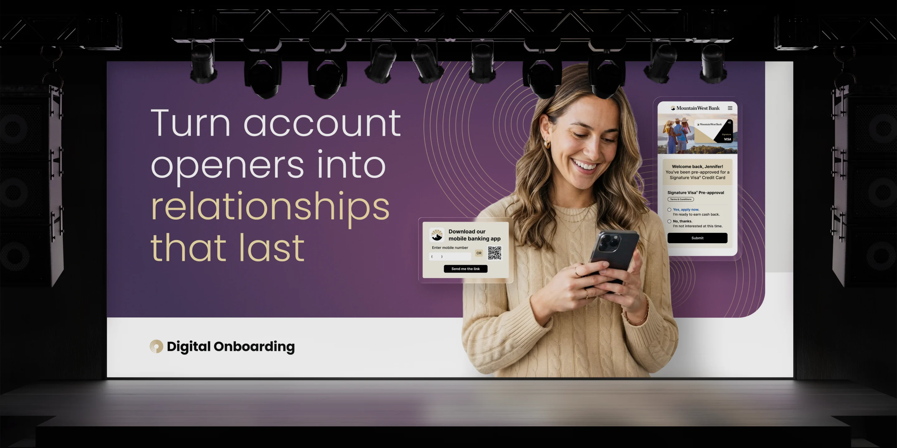
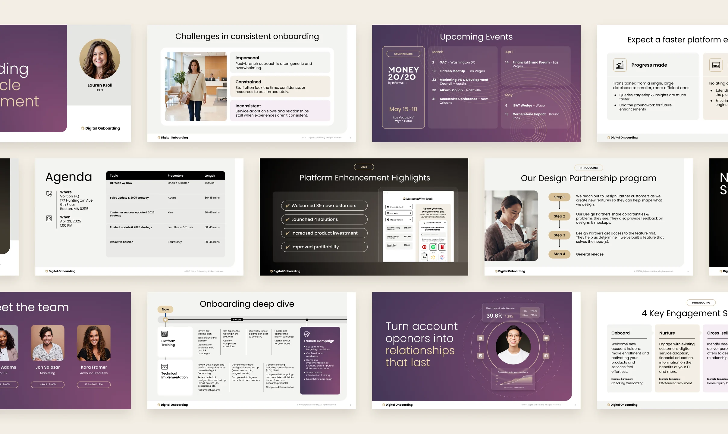
For a sales-driven company, the deck is often where deals are won. I designed a flexible presentation system with title, content, data and story layouts that any team member can pick up and use with confidence. I also designed and produced key sales and investor presentations, turning complex product stories into clear, compelling narratives. Whether it’s a first-call pitch or a board meeting, Digital Onboarding always walks in looking its best.

Through shifting leadership, lean budgets and tight deadlines, the vision held. Digital Onboarding now has a brand as confident and easy to engage with as the platform behind it. It’s proof that a small team, with the right creative partner, really can do big things.
Turning an overlooked asset into a legitimate business growth driver in under 30 days.